Let's Learn Eleventy (11ty) - Images
In the first part, the second part, and the third part parts we have seen:
- What is Eleventy and how to install it
- How to use data inside a page
- Basic configuration
- Using the same template on multiple pages
- How to use collections
- What are slots, includes, and shortcodes, or how to create components
This time we’ll talk about using images in Eleventy. Of course, we could use the img element, it’s easy to use, in both HTML and Markdown. But it has so many downsides: you can use a single type of image (e.g jpeg), the same image will be displayed on HD screens and small mobile screens - every device will download the same image, and people on slow 2G or 3G connections will not be happy.
We can do better using the picture element - that solves all the above issues - and luckily we can use an Eleventy plugin, eleventy-img that can generate images in different formats and sizes.
Goals
We have two goals:
- The HTML output should be a picture element.
- A reusable component that should generate that HTML output
1. picture element
Why picture element instead of img? There are a lot of reasons, most importantly we can use different image formats. If you want to learn more, please read what I have written about the picture element.
We want an HTML output like this:
<picture>
  <source
    type="image/avif"
    srcset="
      /img/dog_large.avif  1280w,
      /img/dog_medium.avif  640w,
      /img/dog_small.avif   320w
    "
    sizes="(min-width: 640px) 50vw, 100vw"
  />
  <source
    type="image/webp"
    srcset="
      /img/dog_large.webp  1280w,
      /img/dog_medium.webp  640w,
      /img/dog_small.webp   320w
    "
    sizes="(min-width: 640px) 50vw, 100vw"
  />
  <source
    type="image/jpg"
    srcset="
      /img/dog_large.jpg  1280w,
      /img/dog_medium.jpg  640w,
      /img/dog_small.jpg   320w
    "
    sizes="(min-width: 640px) 50vw, 100vw"
  />
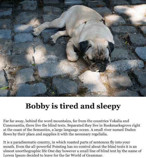
  <img src="/img/dog_medium.jpg" alt="My pug, Bobby" />
</picture>
Because:
- Uses different image formats, the high performant AVIF when the browser supports it, WebP or JPG if not. Thus we load the image with fewer kilobytes.
- Uses the large, medium, or small image based on the screen size and the size of the image spot on the screen. Thus we don’t load big images on small screens.
- If the browser doesn’t support the picture element, it will use the img element inside it.
You may wonder if these fancy image formats like AVIF or WebP are worth it. Just to give you an idea, the original JPEG file was 91KB, the WebP version is 70KB (-23%), and the AVIF 30KB (-67%). So what you think?
Here is the layout we are trying to implement, and that’s why we use sizes.
- On the desktop, the image is displayed on half of the screen width

- On mobile, the image is displayed full-screen width

2. A component
There are different options for creating components in Eleventy (I have written about that in the third part of this series), but in this case, the best option would be a shortcode.
The shortcode has a name followed by the arguments separated by comma:
{% <shortcode-name> <image-url>, <image alt>, <sizes>, <caption> %}
For example:
{% image "./src/images/dog.jpg", "My pug, Bobby", "(min-width: 640px) 50vw,
100vw", "Bobby sleeping in shade" %}
Shortcode name is “image.” Shortcode parameters:
- image url: ”./src/images/dog.jpg”. This is our original image, ideally the tooling will generate .avif and .webp versions.
- image alt: “My pug, Bobby”
- sizes: “(min-width: 640px) 50vw, 100vw” (Means that if the screen width is at least 640px, the image will be displayed on half the screen. Under 640px will be displayed full screen)
- caption: “Bobby sleeping in shade” (If provided we will wrap the picture inside a figure element)
The Implementation of the shortcode
We use the eleventy-img plugin to generate all the images, more exactly it’s Image function.
Generate the images
The Image function requires the following information:
- The path to the original image
- The sizes we want for the images
- The formats we want
const Image = require("@11ty/eleventy-img");

// Note: async / await
async function createImages(src) {
  const metadata = await Image(src, {
    widths: [320, 640, 1280],
    formats: ["avif", "webp", "jpeg"],
  });
}
The metadata object contains information about each image that was generated. We have three image formats (avif, webp, and jpeg). For each we have three sizes (320, 640, and 1280):
{ avif:
   [ { format: 'avif',
       width: 320,
       height: 213,
       filename: '50576aa3-320.avif',
       outputPath: 'dist/img/50576aa3-320.avif',
       url: '/img/50576aa3-320.avif',
       sourceType: 'image/avif',
       srcset: '/img/50576aa3-320.avif 320w',
       size: 7213 },
     { format: 'avif',
       width: 640,
       ...
      },
     { format: 'avif',
       width: 1280,
       ...
      }
  ],
  webp:
   [ { format: 'webp',
       width: 320,
       ... },
     { format: 'webp',
       width: 640,
       ... },
     { format: 'webp',
       width: 1280,
       ... }
  ],
  jpeg:
   [ { format: 'jpeg',
       width: 320,
       ... },
     { format: 'jpeg',
       width: 640,
       ... },
     { format: 'jpeg',
       width: 1280,
       ... }
    ]
}
One issue we can have with the metadata is the name of a generated image. What if we want to change that?
Well in that case we should provide to Image a function called filenameFormat that does it.
const Image = require("@11ty/eleventy-img");

// Note: async / await
async function createImages(src) {
  const imageSizes = {
    320: "small",
    640: "medium",
    1280: "large",
  };

  const metadata = await Image(src, {
    widths: Object.keys(imageSizes).map((k) => +k),
    formats: ["avif", "webp", "jpeg"],
    filenameFormat: function (id, src, width, format, options) {
      const extension = path.extname(src);
      const name = path.basename(src, extension);
      const size = imageSizes[width + ""];
      return `${name}_${size}.${format}`;
    },
  });
}
Now, if our original image is dog.jpg, the names of the images will look like this:
{ avif:
   [ { format: 'avif',
       width: 320,
       height: 213,
       filename: 'dog_small.avif',
       outputPath: 'dist/img/dog_small.avif',
       url: '/img/dog_small.avif',
       sourceType: 'image/avif',
       srcset: '/img/dog_small.avif 320w',
       size: 7213 },
     { format: 'avif',
       width: 640,
       height: 426,
       filename: 'dog_medium.avif',
       outputPath: 'dist/img/dog_medium.avif',
       url: '/img/dog_medium.avif',
       sourceType: 'image/avif',
       srcset: '/img/dog_medium.avif 640w',
       size: 22961 },
     { format: 'avif',
       width: 1280,
       height: 853,
       filename: 'dog_large.avif',
       outputPath: 'dist/img/dog_large.avif',
       url: '/img/dog_large.avif',
       sourceType: 'image/avif',
       srcset: '/img/dog_large.avif 1280w',
       size: 74347 } ],
  webp: ...,
  jpeg: ...
One final note, we can also provide an output folder for the images, by setting the outputDir:
const Image = require("@11ty/eleventy-img");

// Note: async / await
async function createImages(src) {
  const metadata = await Image(src, {
    widths: [320, 640, 1280],
    formats: ["avif", "webp", "jpeg"],
    outputDir: "./dist/img",
  });
}
Generate the HTML output
Once we have the metadata, we can use it to generate the picture.
The simplest version of the shortcode uses Image.generateHTML, from the same plugin, to generate the HTML output.
In most cases, this should be enough.
const Image = require("@11ty/eleventy-img");

function wrapFigure(output, caption) {
  return `
    <figure>
      ${output}
      <figcaption>${caption}</figcaption>
    <figure>
  `;
}

async function imageShortcode(src, alt, sizes = "", caption = "") {
  // create images and return the files metadata
  const metadata = await Image(src, {
    widths: [320, 640, 1280],
    formats: ["avif", "webp", "jpeg"],
  });

  const imageAttributes = {
    alt,
    sizes,
    loading: "lazy",
    decoding: "async",
  };

  const pictureOutput = Image.generateHTML(metadata, imageAttributes);

  return caption ? wrapFigure(pictureOutput) : pictureOutput;
}

module.exports = imageShortcode;
If we need complete control of the output we can add our implementation instead of using Image.generateHTML:
const Image = require("@11ty/eleventy-img");

function wrapFigure(output, caption) {
  return `
    <figure>
      ${output}
      <figcaption>${caption}</figcaption>
    <figure>
  `;
}

function generateHTML(metadata, imageAttributes) {
  // use the lower resolution width, height and url for the img
  let lowsrc = metadata.jpeg[0];

  return `<picture>
    ${Object.values(metadata)
      .map((imageFormat) => {
        return `  <source type="${
          imageFormat[0].sourceType
        }" srcset="${imageFormat
          .map((entry) => entry.srcset)
          .join(", ")}" sizes="${imageAttributes.sizes}">`;
      })
      .join("\n")}
      <img
        src="${lowsrc.url}"
        width="${lowsrc.width}"
        height="${lowsrc.height}"
        alt="${imageAttributes.alt}"
        loading="lazy"
        decoding="async">
    </picture>`;
}

async function imageShortcode(src, alt, sizes = "", caption = "") {
  // create images and return the files metadata
  const metadata = await Image(src, {
    widths: [320, 640, 1280],
    formats: ["avif", "webp", "jpeg"],
  });

  const imageAttributes = {
    alt,
    sizes,
  };

  const pictureOutput = generateHTML(metadata, imageAttributes);

  return caption ? wrapFigure(pictureOutput) : pictureOutput;
}

module.exports = imageShortcode;
Add the shortcode in configuration file
Before we can use the shortcode, we need to tell Eleventy about it, meaning we need to add it the
.eleventy.js:
const imageShortcode = require('./<path-to-file>/imageShortcode.js');

module.exports = function(eleventyConfig) {
  ...
  eleventyConfig.addShortcode("image", imageShortcode);
  ...
};
Use the shortcode inside markdown
Finally, we can use the shortcode as planed:
---
title: "Eleventy Images Demo"
---

Hello
{% image "./src/images/dog.jpg", "My pug, Bobby",  "(min-width: 640px) 50vw, 100vw", "Bobby sleeping in shade" %}
Using images from the same folder
In all the above examples, we had to provide the path to the images relative to the project folder, e.g. ”./src/images/dog.jpg”. What if we want to use an image from the current folder? In some cases, I like to keep the images in the same folder with the current page, not in a single, global folder.
We could use the page inputPath to create the absolute path Eleventy needs to find the image. So, for example, inside our
shortcode implementation we check if the source starts with a dot and if not we assume is a local image:
async function imageShortcode(src, alt, sizes='', caption='') {
  let imgSrc = src;

  // handle same folder images, append the input path to make the path relative
  // to project folder as 11ty requires it
  if (!imgSrc.startsWith('.')) {
    const inputPath = this.page.inputPath;
    const pathParts = inputPath.split('/');
    pathParts.pop();
    imgSrc = pathParts.join('/') + '/' + src;
  }

  // create images and return the files metadata
  const metadata = await Image(imgSrc, {
    widths: [320, 640, 1280],
    formats: ["avif", "webp", "jpeg"]
  });

  ...
};
In Markdown, we use “dog.jpg” as the source instead of ”./src/blog/mypost/dog.jpg”:
{% image "dog.jpg", "My pug, Bobby", "(min-width: 640px) 50vw, 100vw", "Bobby sleeping in shade" %}
Taking it full monty with art direction
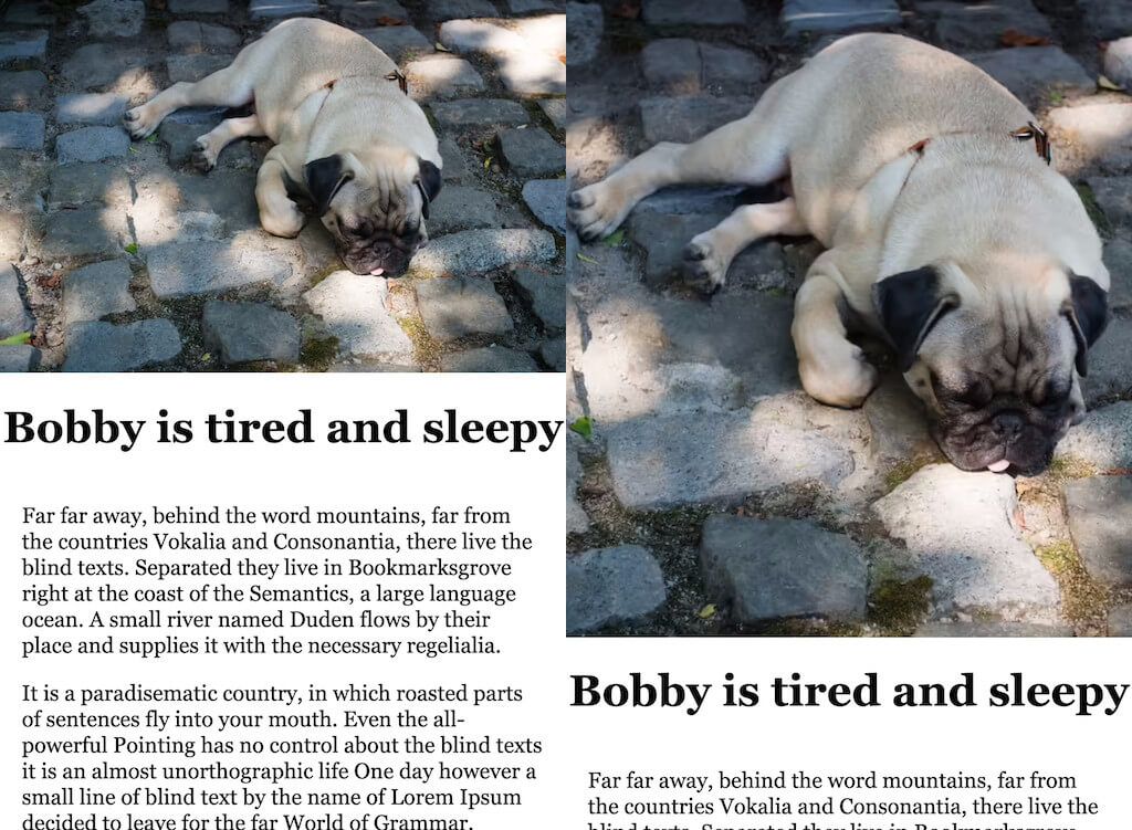
We usually use landscape images on the desktop, and they look very small on mobile, and most of the image details are not visible, so why don’t we show a “zoomed in” part of the image on mobile?
Take a look at the image below. On the left, we use the original image and on the right, we use a version of the image that shows only a part of the original. Sometimes people do something like this, some use a completely different image. This is called art direction.

To do something like this, we need a couple of more things:
- the second image source
- the second image media(query)
- and optionally different sizes for this second image
{% image "./src/images/dog.jpg", "My pug, Bobby", "(min-width: 640px) 50vw,
100vw", "", "./src/images/dogdetail.png", "(max-width: 480px)", "100vw" %}
Here is the updated code:
...

function generateHTML(metadata, imageAttributes, detailMetadata, detailMedia, detailSizes) {
  // use the lower resolution width, height and url for the img
  let lowsrc = metadata.jpeg[0];

  const detailOutput = detailMetadata ?
    Object.values(detailMetadata).map(imageFormat => {
      return `  <source type="${imageFormat[0].sourceType}"
                        srcset="${imageFormat.map(entry => entry.srcset).join(", ")}"
                        media="${detailMedia}"
                        sizes="${detailSizes}">`
    }).join('\n') : '';

  const sources = detailOutput +
    Object.values(metadata).map(imageFormat => {
      return `  <source type="${imageFormat[0].sourceType}" srcset="${imageFormat.map(entry => entry.srcset).join(", ")}"  sizes="${imageAttributes.sizes}">`;
    }).join('\n')

  return `<picture>
    ${sources}
      <img
        src="${lowsrc.url}"
        width="${lowsrc.width}"
        height="${lowsrc.height}"
        alt="${imageAttributes.alt}"
        loading="lazy"
        decoding="async">
    </picture>`;
}

async function imageWithDetailShortcode(src, alt, sizes, caption, detailSrc, detailMedia, detailSizes = "100vw") {

  const imageSizes = {
    "320": "small",
    "640": "medium",
    "1280": "large"
  }

  let metadata = await Image(src, {
    widths: Object.keys(imageSizes).map(k => +k),
    formats: ["avif", "webp", "jpeg"],
    outputDir: "./dist/img/",
    filenameFormat: function (id, src, width, format, options) {
      const extension = path.extname(src);
      const name = path.basename(src, extension);

      const size = imageSizes[width + ""];
      return `${name}_${size}.${format}`;
    }
  });

  // need to generate metadata for the second image also
  let detailMetadata = detailSrc && detailMedia ? await Image(detailSrc, {
    widths: Object.keys(imageSizes).map(k => +k),
    formats: ["avif", "webp", "jpeg"],
    outputDir: "./dist/img/",
    filenameFormat: function (id, src, width, format, options) {
      const extension = path.extname(src);
      const name = path.basename(src, extension);

      const size = imageSizes[width + ""];
      return `${name}_${size}.${format}`;
    }
  }) : null;

  let imageAttributes = {
    alt,
    sizes
  };

  const pictureOutput = generateHTML(metadata, imageAttributes, detailMetadata, detailMedia, detailSizes);

  return caption ? wrapFigure(pictureOutput) : pictureOutput;
}
...
Resources
- For more info, you can check the 11ty docs.
- Maximally optimizing image loading for the web in 2021
- My post about the The picture element